News | Posted February 25, 2026
Inside Planning Aid Scotland’s first Digital Mapping Hackathon
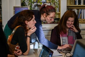
Volunteers joined in person and online for a hands-on QGIS workshop, collaboratively building their digital mapping skills and exploring place-based spatial data
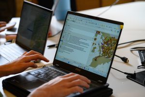
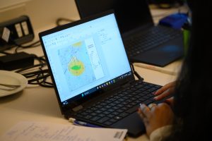
Screens filled with layers of colour: transport lines, schools and GPs. By the end of the day, those overlapping datasets would tell a story.
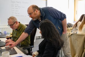
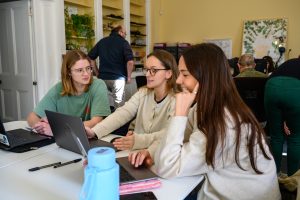
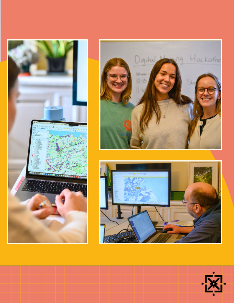
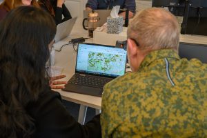
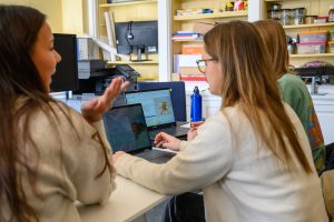
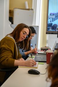
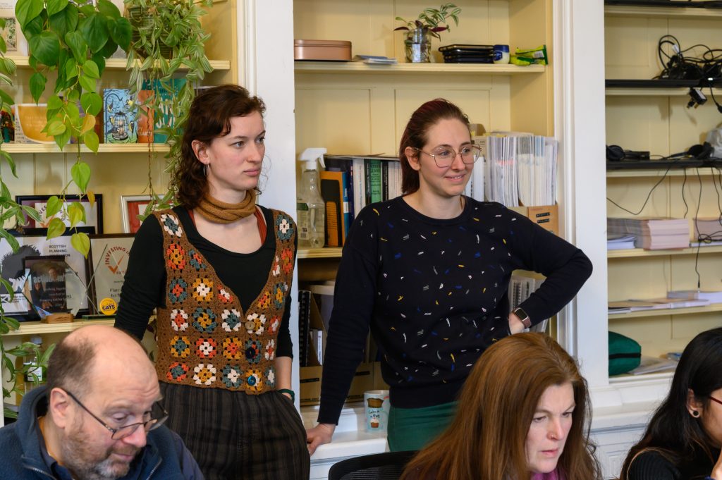
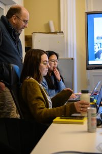
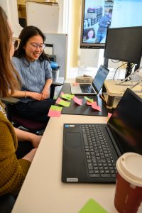
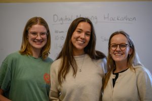
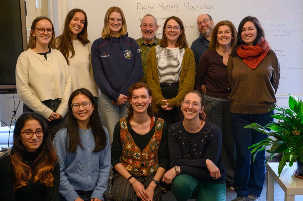
Planning Aid Scotland hosted its first Digital Mapping Hackathon as a hybrid event. Part online, part in person, it brought together 6 teams in a collective experiment: to establish the “best” areas to live in Edinburgh. To do this, they used QGIS, a free mapping tool that is becoming increasingly important in modern planning.

The premise was simple. Each team defined what mattered most: proximity to public transport, access to shops and services, generous green space, lower flood risk. But the conversation quickly became more detailed.
Some teams brought in the Scottish Index of Multiple Deprivation (SIMD), looking at how income and employment levels link to people’s access to opportunities across the city.
Others tested the principles of the 20-minute neighbourhood, the idea that daily needs should be met within a short walk or cycle from home, and asked how close Edinburgh already is to that ambition.
Some groups also considered the seasonal impact of the Christmas Market and the Fringe. They discussed how large events can create vibrancy, but also increase rents, crowding and pressure on local services. They raised bigger questions about what makes an area liveable.
Our Volunteer Coordinator Jo Elston said: “Seeing all of the enthusiasm from the teams was amazing, people really engaged with the task with one team creating a full persona description to work with! Overall I found the day really fun and it seems like everyone learned something – I would love to run some more!”
The notion of the “liveable city” became a theme. Is liveability about convenience? Equity? Environmental quality? Community? By translating these concepts into spatial criteria, participants considered the impacts of planning decisions.
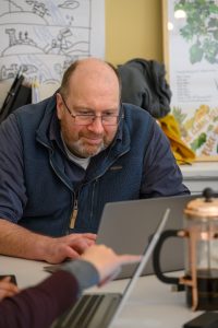
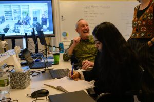
Iain Paton, who helped facilitate and deliver the training, described it as “a comprehensive QGIS workout, looking at Edinburgh place-based data, with some great ideas and work. I did not know that filter expressions could be used for symbology, so thank you for that knowledge. I hope there will be more of these events, to benefit planners interested in spatial data and vice versa.”
His comment hints at the deeper purpose of the day. Planning is often seen as paperwork and policy. Yet beneath every development proposal lies an invisible architecture of data. Learning to explore and visualise that data helps people not just to understand decisions, but to influence them.
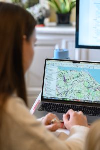
Throughout the hackathon, teams explored how different datasets could be overlaid to reveal patterns and tensions. An area rich in green space might score poorly on transport links. A neighbourhood close to amenities might sit within a flood risk zone. A district aligned with 20-minute neighbourhood principles might still reveal inequalities when viewed through SIMD data. By adjusting filters and symbology, participants could see in real time how their priorities reshaped the map.
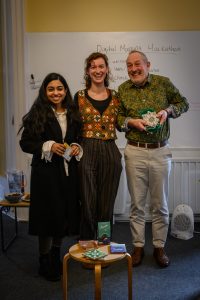
Presentation judging process
At the end of the session, each team presented its findings, and the results were judged across three categories:
Best visualisation: awarded to the team who produced the most visually clear and compelling map.
Most pythonic method: recognising the team who used the most direct and straightforward analytical approach to finding the best place.
Most creative method: acknowledging the team whose approach stood out for its originality whether through inventive criteria, unexpected combinations of datasets or distinctive interpretation of the best place.
Different results, shared learning
When the teams presented their completed maps, the results were fascinating. Using different criteria, priorities and datasets they each identified a different “best” area to live in Edinburgh. As soon as the focus shifted, the outcome changed.
Side by side, the maps told very different stories.
The results showed how strongly our choices depend on what we value and how powerful spatial data can be in revealing those differences.
With QGIS, spatial data is easier to understand, and anyone can explore datasets and use them to support evidence-based decisions.
There was, inevitably, a sense at the end of the day that this was only the beginning. New skills had been learned, new questions had been raised. The Digital Mapping Hackathon has already shown that, with the right support, young planners can deepen their knowledge and skills remarkably quickly. More importantly, sessions like this ensure those skills can be channeled into community-led plans including Local Place Plans, where data-driven insight can genuinely shape better places.
Volunteer with us
All photos by John Swan photography
If you are interested in volunteering with Planning Aid Scotland, or would like to learn more, please contact volunteer@pas.org.uk